Code
rm(list = ls())
# Import libraries
library(tidyverse)
library(sf)
library(tmap)
library(here)
library(gt)
library(gtExtras)
library(patchwork)
library(testthat)Present-day environmental justice may reflect legacies of injustice in the past. The United States has a long history of racial segregation which is still visible. During the 1930’s the Home Owners’ Loan Corporation (HOLC), as part of the New Deal, rated neighborhoods based on their perceived safety for real estate investment. Their ranking system, (A (green), B (blue), C (yellow), D (red)) was then used to block access to loans for home ownership. Colloquially known as “redlining”, this practice has had widely-documented consequences not only for community wealth, but also health.Redlined neighborhoods have less greenery, and are hotter than other neighborhoods.
This post will seek to shed light on how these redlining practices have effected environmental health in Los Angeles today, using citizen science data.
rm(list = ls())
# Import libraries
library(tidyverse)
library(sf)
library(tmap)
library(here)
library(gt)
library(gtExtras)
library(patchwork)
library(testthat)# Read in data as sf objects
epa_block_level <- st_read(here("posts", "2025-1-1-redlining","data", "ejscreen/EJSCREEN_2023_BG_StatePct_with_AS_CNMI_GU_VI.gdb"))
redlining <- st_read(here("posts", "2025-1-1-redlining","data", "mapping-inequality/mapping-inequality-los-angeles.json"))
bird_obs <- st_read(here("posts", "2025-1-1-redlining","data", "gbif-birds-LA/gbif-birds-LA.shp"))# Confirm that all data sets are using WGS 84
st_crs(redlining)
st_crs(bird_obs)
st_crs(epa_block_level) # This data does not have geometry, so the CRS is irrelevant
if(st_crs(redlining) != st_crs(bird_obs) || st_crs(redlining) != st_crs(epa_block_level)) {
warning("Coordinate systems do not match")
} else {
print("All coordinate systems match")
}
# Ah-oh, gotta fix one coordinate system, and then run the test again
epa_block_level <- st_transform(epa_block_level, crs = st_crs(redlining))
if(st_crs(redlining) != st_crs(bird_obs) || st_crs(redlining) != st_crs(epa_block_level)) {
warning("Coordinate systems do not match")
} else {
print("All coordinate systems match")
}# Filter the EPA data to only contain data from Los Angeles County
epa_la <- epa_block_level |>
filter(epa_block_level$CNTY_NAME == "Los Angeles County")First up, we have a map that shows the historically redlined districts in Los Angeles.
# To solve for errors involving invalid polygons, I used the filter function
redlining <- redlining |>
filter(st_is_valid(redlining))# Finally, on to mapping!
bbox_la <- st_bbox(redlining)
tm_shape(epa_la, bbox = bbox_la) +
tm_polygons(col = "white") +
tm_shape(redlining) +
tm_polygons(title = "HOLC\nGrade",
col = "grade",
palette = ("YlOrRd")) +
tm_compass(type = "rose", size = 4, position = c("right", "top"), text.size = 0.60) +
tm_scale_bar(text.size = 0.50, position = c("left", "bottom")) +
tm_layout(main.title = "Historically Redlined Districts in Los Angeles",
bg.color = "linen",
legend.position = c("right", "bottom"))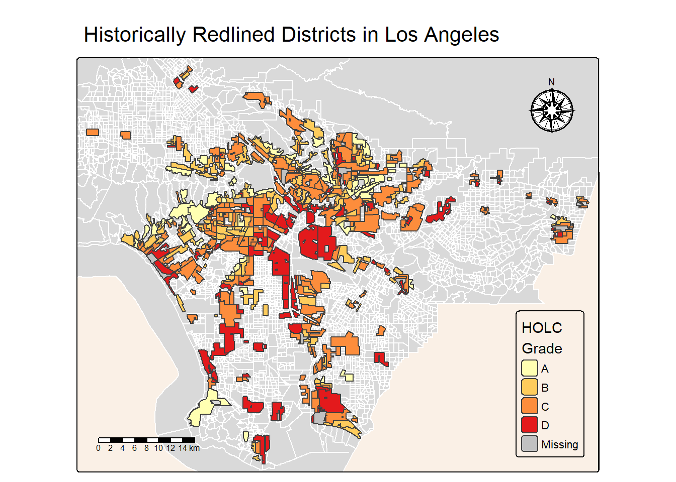
Let’s see a table that summarizes the percent of current census block groups within each HOLC grade (or none).
# To do this, I will need to perform a st_join on the datasets in order to get both census block group data and HOLC grade data onto the same dataframe

census_grades <- st_join(x = epa_la, y = redlining, join = st_intersects, left = TRUE) |>
  group_by(grade) |>
  summarise(count_blocks = n(), # The number of blocks in each HOLC grade
            percentage = (n() /nrow(epa_la)) * 100) |> # Math to calculate %
  st_drop_geometry() # This will make it a table without the geometry data in the way

test_that("All percentage values are greater than 0", {
  expect_true(all(census_grades$percentage > 0))
})
Test passed 🎉# Now, lets make a table using the gt package that makes the table look like its from the New York Times!
nyt_tab <- census_grades |>
gt() |>
gt_theme_nytimes() |>
tab_header(title = "Percentage of Current Census Blocks within HOLC Grades") |>
cols_label(
grade = "HOLC Grade",
count_blocks = "Block Count",
percentage = "% within Grade"
) |>
tab_style(
style = cell_text(weight = "bold"),
locations = cells_body()
)
nyt_tab| Percentage of Current Census Blocks within HOLC Grades | ||
|---|---|---|
| HOLC Grade | Block Count | % within Grade |
| A | 449 | 6.81232 |
| B | 1206 | 18.29768 |
| C | 2748 | 41.69322 |
| D | 1300 | 19.72387 |
| NA | 3097 | 46.98832 |
This table illustrates the percentages of census blocks that fall within historic HOLC graded areas. Interestingly, excluding NAs, most census blocks fall within the C grade.
The effects of this redlining has had an effect on these neighborhoods to this day. Using data from the Environmental Protection Agency Environmental Justice Screening and Mapping tool from Los Angeles county, we can make figures that show these long lasting effects.
# Perform spatial join and group by HOLC grade
summary_df <- st_join(x = epa_la, y = redlining, join = st_intersects, left = TRUE) |>
  group_by(grade) |>
  summarise(
    mean_low_income = mean(LOWINCPCT, na.rm = TRUE),
    mean_pm25 = mean(P_D2_PM25, na.rm = TRUE),
    mean_life_expectancy = mean(P_LIFEEXPPCT, na.rm = TRUE)
  ) |>
st_drop_geometry() # Remove spatial data# Bar plot for % low income
income_plot <- ggplot(summary_df, aes(x = grade, y = mean_low_income)) +
geom_bar(stat = "identity", fill = "indianred3") +
labs(title = "Average of Low Income\nHouseholds by\nHOLC Grade", x = "HOLC Grade", y = "Mean % Low Income Households") +
theme_bw()
life_plot <- ggplot(summary_df, aes(x = grade, y = mean_life_expectancy)) +
geom_bar(stat = "identity", fill = "tan1") +
labs(title = "Average Life\nExpectancy\nby HOLC Grade", x = "HOLC Grade", y = "Mean % Life Expectancy") +
theme_bw()
particulate_plot <- ggplot(summary_df, aes(x = grade, y = mean_pm25)) +
geom_bar(stat = "identity", fill = "peachpuff") +
labs(title = "Average of Particulate\nMatter 2.5 in Air\nby HOLC Grade", x = "HOLC Grade", y = "Mean % Particulate Matter 2.5") +
theme_bw()
(income_plot | particulate_plot | life_plot) & theme_bw()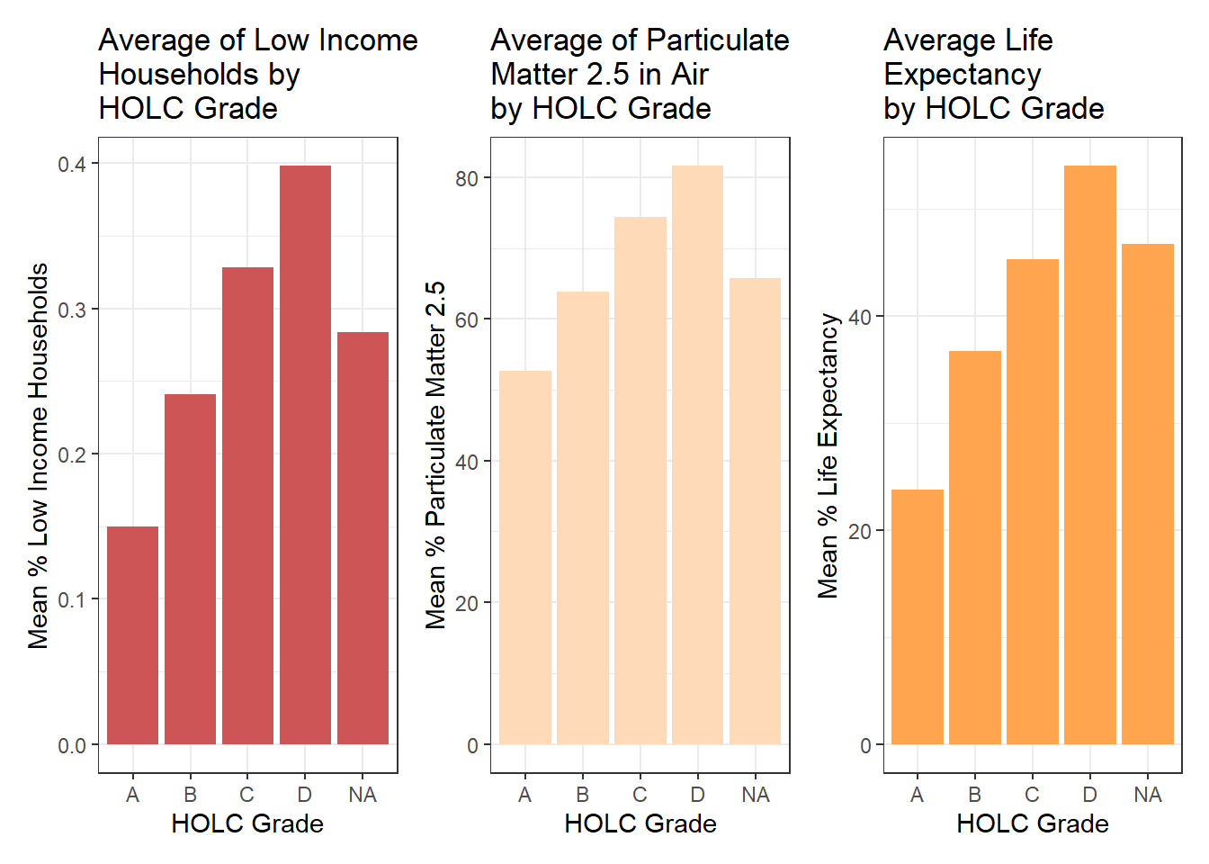
This bar graph shows the average number of low income households per HOLC grade.As we can see, the lower the grade becomes, the higher the percentage of low income households. This goes to show that poverty may be directly linked with these HOLC grades, even though these are modern statistics about income.
Similar results are reflected in both the average of particulate matter, and the average life expectancy. This would suggest a correlation between all of these variables. In summary, even though these HOLC grades were given over a century ago, they are still having an effect today on the quality of life for people in these grades. Specifically, the lower grade areas have been held in poverty and detrimental environmental conditions.
A recent study found that redlining has not only affected the environments communities are exposed to, it has also shaped our observations of biodiversity.4 Community or citizen science, whereby individuals share observations of species, is generating an enormous volume of data. Ellis-Soto and co-authors found that redlined neighborhoods remain the most undersampled areas across 195 US cities. This gap is highly concerning, because conservation decisions are made based on these data.
The below chart and bar plot show the total number of bird observations from 2022, per HOLC grade.
# First, filter birds data so that it only contains the year we are interested in - in this case, 2022
bird_obs_2022 <- bird_obs |>
filter(year == 2022)# Then, do a join of the HOLC and bird data, grouping by grade
grade_birds <- st_join(x = redlining, y = bird_obs_2022, join = st_intersects, left = TRUE) |>
group_by(grade) |>
summarise(numberof_birds = n()) |> # Count the number of bird obs per grade
st_drop_geometry() # This will make it a table without the geometry data in the way# Create a fancy table with the dataframe created above
bird_tab1 <- grade_birds |>
gt() |>
gt_theme_nytimes() |>
tab_header(title = "Number of GBIF Bird Observations\nwithin HOLC Grades") |>
cols_label(
grade = "HOLC Grade",
numberof_birds = "Number of Bird Observations",
) |>
tab_style(
style = cell_text(weight = "bold"),
locations = cells_body()
)
bird_tab1| Number of GBIF Bird Observations within HOLC Grades | |
|---|---|
| HOLC Grade | Number of Bird Observations |
| A | 1078 |
| B | 1323 |
| C | 2360 |
| D | 2000 |
| NA | 273 |
# Make a bar plot of the above tables data
#| eval: true
#| echo: true
bird_plot1 <- ggplot(grade_birds, aes(x = grade, y = numberof_birds)) +
  geom_bar(stat = "identity", fill = "indianred3") +
  labs(title = "Number of GBIF Bird Observations by HOLC Grade", x = "HOLC Grade", y = "Number of Bird Observations") +
  theme_bw()

bird_plot1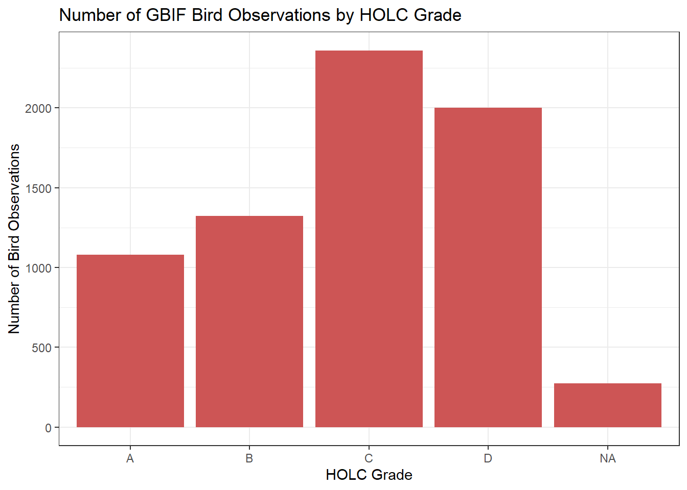
Now, as we can see, this data does not line up with the findings from Soto et al 2023. However, this is likely because we have not yet accounted for the fact that not very many of our geospatial points contain higher grades. This can be accounted for with code, by summarizing the total observations by area.
Using this summarized data, we can make the following graph and corresponding bar chart:
# I had already joined my datasets, leaving out some area data. I did a rejoin to regain that data

actual_birds <- st_join(x = redlining, y = bird_obs_2022, join = st_intersects, left = TRUE) |>
  group_by(grade) |>
  summarize(total_area = sum(area, na.rm = TRUE),
            grade_count = n()) |>
  mutate(bird_count_area = grade_count/total_area) |>
  select(grade, bird_count_area) |>
st_drop_geometry()bird_tab2 <- actual_birds |>
gt() |>
gt_theme_nytimes() |>
tab_header(title = "Number of GBIF Bird Observations within HOLC Grades, accounting for Scale Differences") |>
cols_label(
grade = "HOLC Grade",
bird_count_area = "Number of Bird Observations",
) |>
tab_style(
style = cell_text(weight = "bold"),
locations = cells_body()
)
bird_plot2 <- ggplot(actual_birds, aes(x = grade, y = bird_count_area)) +
geom_bar(stat = "identity", fill = "tan1") +
labs(title = "Number of GBIF Bird Observations within HOLC Grades\naccounting for Scale Differences", x = "HOLC Grade", y = "Number of Bird Observations") +
theme_bw()
bird_tab2| Number of GBIF Bird Observations within HOLC Grades, accounting for Scale Differences | |
|---|---|
| HOLC Grade | Number of Bird Observations |
| A | 2980.5113 |
| B | 5213.2797 |
| C | 3102.9699 |
| D | 2064.0089 |
| NA | 392.0854 |
bird_plot2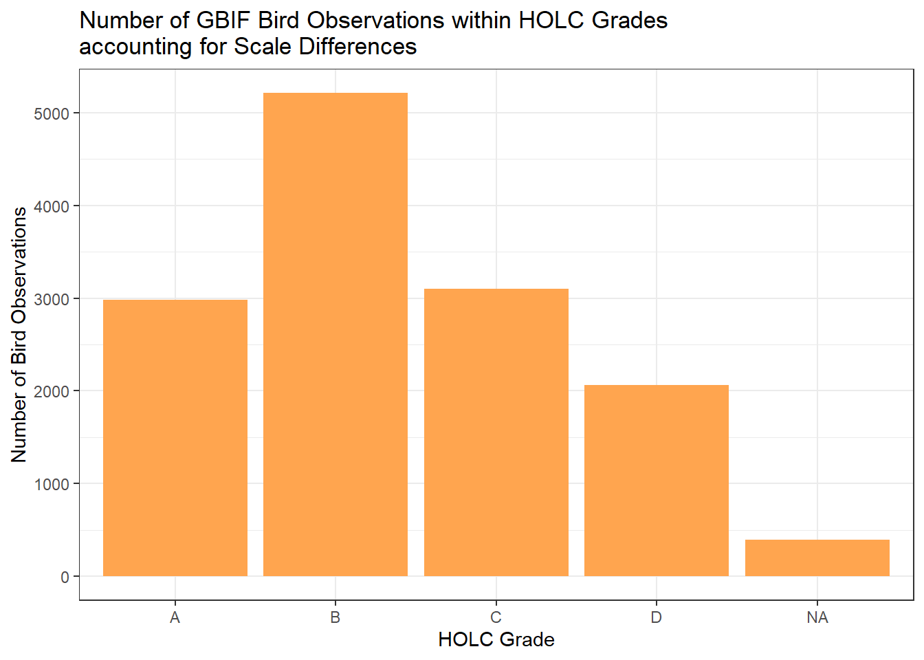
This data shows us that when accounting for differences in number of areas that contain certain grades, the results match more the findings revealed in the 2023 study. This supports the hypothesis that less observations are recorded in areas with a low HOLC grade, which could lead to bias when making biodiversity and environmental health decisions.
@online{jørgensen2025,
  author = {Jørgensen, Bailey},
  title = {A Geospatial Look at the Relationship Between Redlining and
    Citizen Science},
  date = {2025-01-01},
  url = {https://jorb1.github.io/posts/2024-12-20-aquaculture/},
  langid = {en}
}